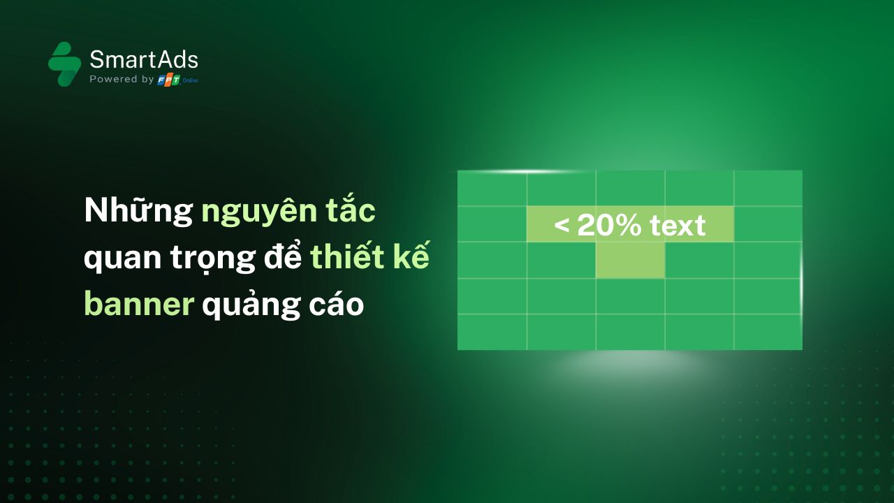
1. Ưu tiên hình ảnh trực quan
-
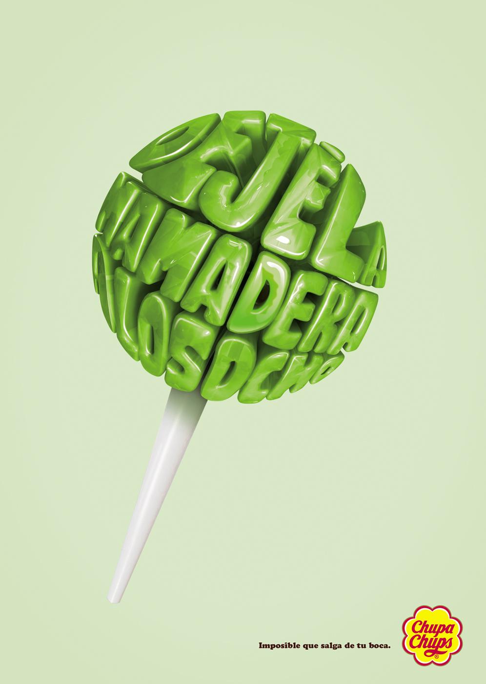
Xác định key visual: Trước khi thêm text, hãy xác định key visual – yếu tố trung tâm dẫn dắt cảm xúc và nhận diện thương hiệu. Key visual phải chứa đựng các ý nghĩa tượng trưng mang đặc quyền thương hiệu. Khi khách hàng nhìn lướt Key visual, họ sẽ dễ dàng nhận diện ra ngay thương hiệu. Và quan trọng, Key visual phải “thay lời muốn nói”, đánh vào cảm xúc của khách hàng để gây ấn tượng tốt nhất. Ở bước này, cần chọn ảnh sản phẩm/dịch vụ thật nổi bật, truyền tải ngay thông điệp chính. Hình ảnh cần trở thành “điểm hút” đầu tiên, để phần text chiếm 20% không bị gượng ép mà vẫn tạo ấn tượng mạnh mẽ. Đây là cơ sở để xây dựng bản nháp wireframe, bố cục (layout draft) để định rõ vị trí ảnh, logo, và vùng dành cho text, đảm bảo tổng thể hài hòa.
-
Thiết kế wireframe: Bắt đầu bằng phác thảo tay (low-fidelity) để nhanh chóng thử nhiều phương án bố cục. Khi đã chốt hướng, chuyển sang bản kỹ thuật số (high-fidelity) nhằm tinh chỉnh chi tiết về màu sắc, font chữ, kích thước và khoảng cách. Cách làm này giúp tiết kiệm thời gian, hạn chế lỗi, và tối ưu hóa thiết kế banner trước khi ra phiên bản cuối.
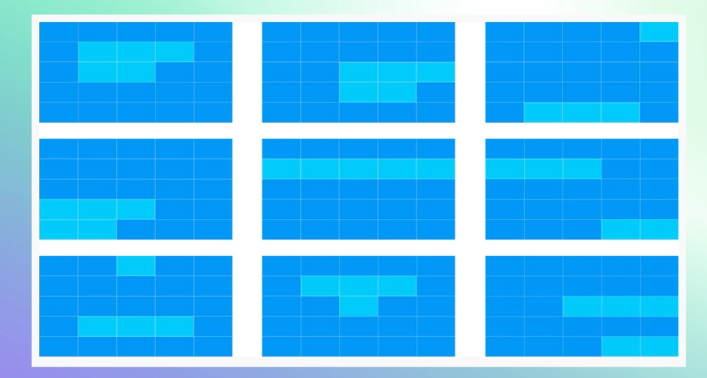
Ngoài ra cần lưu ý rằng, để đảm bảo sự thuận mắt và dễ đọc, nên áp dụng lý thuyết về bố cục F-pattern hoặc Z-pattern để hiểu cách người đọc quét mắt tự nhiên, nhấn các họa tiết hoặc thông điệp quan trọng ở vùng dễ thấy.
>>> Xem thêm về F-pattern và Z-pattern tại đây.
2. Tập trung vào thông điệp (key message) ngắn gọn
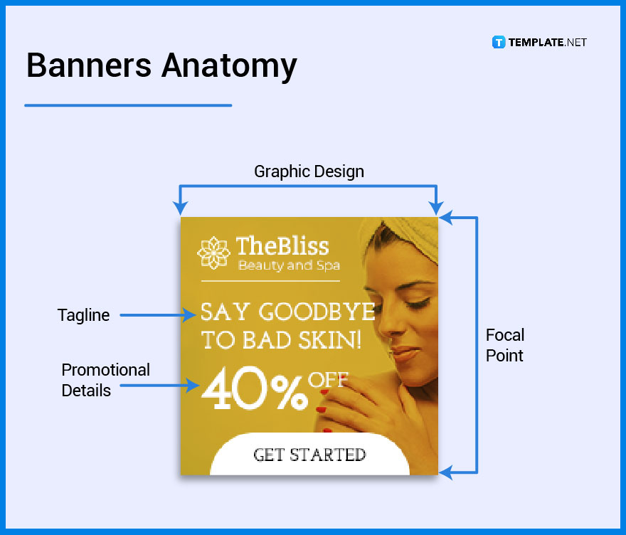
Thông điệp gồm 2 ý chính là hình ảnh và văn bản trên hình.
Đối với hình ảnh, cần lưu ý đến Điểm nhấn thị giác (Focal Point). Đây là khu vực thu hút ánh nhìn đầu tiên, giúp tạo kết nối cảm xúc và định hướng sự chú ý. Focal Point nên gắn liền với thông điệp hoặc sản phẩm chủ đạo, được đặt ở vị trí “vàng” trong bố cục, có độ tương phản cao hoặc nổi bật hơn hẳn so với các yếu tố xung quanh. Một Focal Point tốt không chỉ khiến người xem dừng lại mà còn dẫn dắt họ tiếp tục khám phá các phần còn lại của thiết kế.
Đối với phần văn bản trên hình (Text), nên chia thành 3 phần:
-
Tagline (câu khẩu hiệu chính): Là thông điệp ngắn gọn, súc tích nhất để khẳng định giá trị hoặc điểm khác biệt của thương hiệu/sản phẩm. Đây là dòng chữ cần xuất hiện đầu tiên và dễ ghi nhớ. Tagline hiệu quả nhất là khi nhắm đúng vào nỗi đau (pain point) thực sự của khách hàng.
-
Subtitle / Description (mô tả ngắn): Bổ trợ cho tagline, giải thích thêm ý chính hoặc nhấn mạnh lợi ích cốt lõi. Nội dung chỉ nên một câu ngắn, tránh dài dòng.
-
Promotion text (ưu đãi, khuyến mãi): là dạng văn bản nhằm gợi ý hỗ trợ cho việc thúc đẩy hành động ngay lập tức, ví dụ: “Giảm 30%”, “Miễn phí giao hàng”, “Chỉ hôm nay”. Nội dung này nên được đặt gần CTA để tăng hiệu quả chuyển đổi.
Ngoài ra, cũng cần hạn chế nhồi nhét thông tin vào banner, thay vào đó phần thông tin chi tiết về sản phẩm có thể để trong phần caption hoặc mô tả chi tiết ở trong landing page. Đồng thời có thể kết hợp sử dụng biểu tượng (icon), infographics nhỏ, màu sắc thương hiệu để thay thế các đoạn text dài.
3. Dùng typography bắt mắt
Typography không chỉ để truyền tải thông điệp mà còn là yếu tố thiết kế tạo cảm xúc và nhận diện thương hiệu. Việc lựa chọn typo cần đồng bộ với phong cách thương hiệu để vừa nổi bật vừa dễ đọc. Cụ thể:
-
Typeface: Ưu tiên typeface đơn giản, hiện đại, dễ đọc, hạn chế dùng quá nhiều typeface khác nhau trong cùng một banner.
-
Font chữ: Lựa chọn font phù hợp với điều kiện xung quanh, rõ ràng, dễ đọc trên mọi kích thước màn hình.
-
Tương phản: Tận dụng độ tương phản màu sắc (ví dụ: nền sáng – chữ đậm hoặc nền đậm – chữ sáng).
-
Bố cục: Đặt text vào vùng "focal point" của ảnh kết hợp cùng key visual để tạo hiệu ứng thị giác tốt nhất. Vị trí gợi ý: góc trên/trái hoặc ngay trung tâm nếu ít chữ.
-
Hierarchy: Sắp xếp thứ bậc chữ (headline, subtitle, tagline) rõ ràng để người xem nắm ý chính trước, sau đó mới đọc thông tin bổ trợ.
Ngoài ra, cần phân biệt giữa Typography, Typeface và Font. Typography là nghệ thuật sắp đặt và trình bày chữ để tạo cảm xúc và tính thẩm mỹ. Typeface là “họ chữ” – tập hợp các biến thể cùng một phong cách (ví dụ: Helvetica). Còn Font là phiên bản cụ thể trong họ chữ đó, thường bao gồm kiểu dáng và kích thước (ví dụ: Helvetica Bold 14pt hoặc Helvetica Italic 14pt). Nắm rõ sự khác biệt này giúp bạn có lựa chọn phù hợp và sử dụng các hiệu ứng thiết kế văn bản thống nhất, chuyên nghiệp hơn.
4. Tận dụng không gian trống (white space)
Kỹ thuật này giúp tạo bố cục thoáng đãng, nhấn mạnh nội dung chính. Cụ thể cần lưu ý như sau:
-
Giữ khoảng thở hợp lý: White space giúp banner không bị dồn nén, mang lại cảm giác gọn gàng và dễ tiếp nhận.
-
Hạn chế chữ thừa: Ít chữ hơn giúp tránh vượt quá 20% text, đồng thời giảm cảm giác nặng nề cho người xem.
-
Làm nổi bật sản phẩm: Không gian trống giúp sản phẩm trở thành trung tâm của banner, dễ ghi nhớ hơn.
-
Tăng sức hút cho CTA: Khi xung quanh thoáng, nút CTA nổi bật hơn và dễ thu hút hành động từ khách hàng.
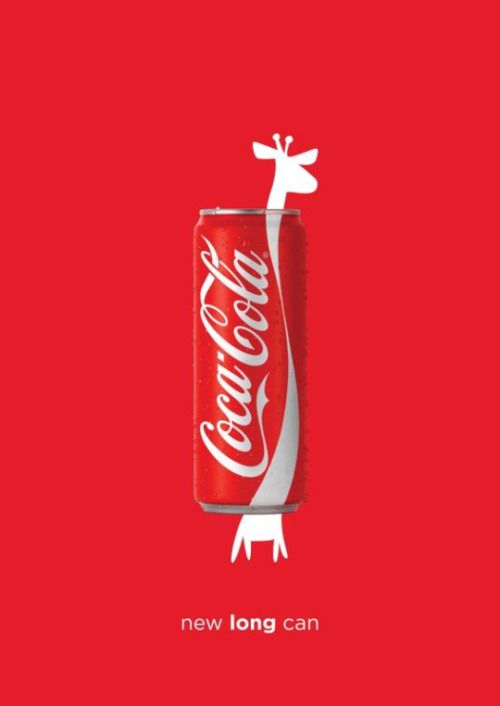
Coca Cola và banner ads dạng white space trong chiến dịch ra mắt sản phẩm mới (Nguồn: Sưu tầm)
5. CTA tinh gọn
-
Ưu tiên CTA ngắn gọn: Dùng những từ súc tích như “Đặt ngay”, “Khám phá”, “Xem thêm” để tiết kiệm không gian chữ mà vẫn rõ ràng.
-
Đặt trong phần button nổi bật: Thay vì rải chữ trên nền ảnh, hãy gom CTA vào nút có màu sắc tương phản để thu hút ánh nhìn.
-
Tạo điểm nhấn hành động: Button CTA vừa giúp người xem tập trung, vừa tăng khả năng nhấp chuột (CTR) nhờ sự rõ ràng về mục tiêu hành động.
-
Trong một số trường hợp CTA có thể không nằm dưới dạng nút mà khéo léo kết hợp vào slogan hoặc văn bản.
Công thức gợi ý chung: Ảnh nổi bật (70–80%) + text chính (10–15%) + CTA button (5–10%) → vừa đúng luật, vừa thu hút.
Case study về key visual của Điện máy xanh – “người xanh” nhảy múa
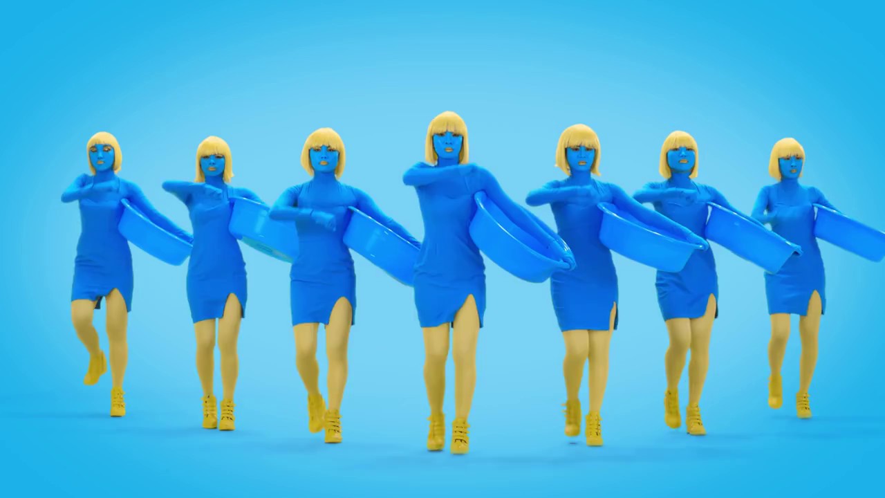
Công thức đơn giản: "Bản sắc" + "Độc lạ" + "Ám ảnh" = Ấn tượng
Chính sự độc lạ này đã khiến người dùng không ngừng tranh cãi, lan tỏa rất mạnh mẽ trong cộng đồng và tạo thành những hot trend. Cụ thể:
-
Bố cục: Tập trung vào nhân vật “người xanh” như key visual chiếm phần lớn diện tích, tạo sự thu hút thị giác ngay lập tức. Logo và thông điệp được đặt ở khu vực trung tâm hoặc cạnh dưới, đảm bảo không bị lấn át. Bố cục đơn giản, dễ nhớ, không bị phân tán.
-
Màu sắc: Chủ đạo là xanh neon + vàng tươi. Đây là cặp màu có độ tương phản cao, gây chú ý mạnh mẽ và tạo bản sắc riêng, khó lẫn với thương hiệu khác. Tuy không “đẹp” theo chuẩn thẩm mỹ thông thường, nhưng cực kỳ hiệu quả trong việc ghi nhớ. Chính sự độc lạ này về bố cục và màu sắc, nhân vật “người xanh” cùng sắc xanh dạ quang đã thành công ghi dấu tính biểu tượng mạnh mẽ.Trong bất kỳ bối cảnh nào, chỉ cần thấy màu xanh ấy, người tiêu dùng dễ dàng liên tưởng đến thương hiệu.
-
Tỷ lệ văn bản (text): Text thường chiếm ít hơn 20% diện tích hình, thay vì diễn giải phức tạp, hình ảnh người xanh nhảy múa kèm điệp khúc lặp lại chỉ tập trung vào slogan “Bạn muốn mua… đến Điện Máy Xanh”. Cách dùng chữ ngắn gọn, lặp lại, giúp người xem nhớ ngay mà không cần đọc nhiều.
-
CTA (Call to Action): Được ẩn trong chính câu slogan – “đến Điện Máy Xanh”. Đây vừa là thông điệp, vừa là lời kêu gọi hành động rõ ràng, không cần thêm nút bấm hay dòng chữ phụ.
Nhìn chung, đây chính là chiến lược cố tình đi ngược chuẩn mực thẩm mỹ quảng cáo lúc bấy giờ, khiến thương hiệu nổi bật giữa thị trường “na ná” nhau. Khi key visual trở thành “sợi chỉ đỏ” gắn kết các hoạt động marketing dài hạn, thương hiệu sẽ dễ dàng xây dựng vị thế top-of-mind trong đối với tâm trí người dùng.
Nếu bạn đang tìm kiếm một giải pháp quảng cáo tối ưu nhận diện và hiệu suất, đừng ngần ngại tạo tài khoản và trải nghiệm setup chiến dịch trên SmartAds tại đây.