I. Bố cục trang web theo F-Pattern
1. Khái niệm chung
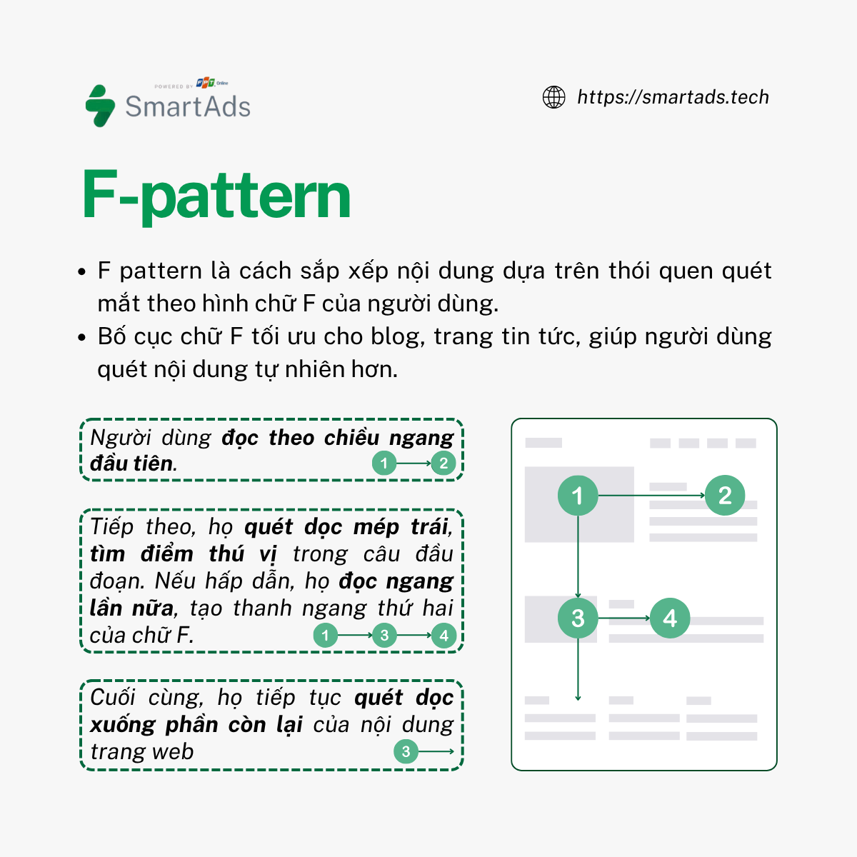
Mô hình F (F-Pattern) mô tả cách người dùng quét mắt nhanh nhất khi tiếp cận các khối nội dung. Người dùng đọc nội dung với tốc độ đáng kinh ngạc trong vài giây, quét qua trang web rất nhanh.
Bố cục webstie theo mô hình này được phổ biến qua nghiên cứu theo dõi ánh mắt của NNGroup, quan sát hành vi của hơn 200 người dùng trên hàng ngàn trang web. Kết quả cho thấy người dùng có xu hướng thể hiện hành vi đọc nhất quán, tạo thành hình chữ "F" với ba bước chính:
-
Người dùng đọc theo chiều ngang đầu tiên – thường là phần trên cùng của khu vực nội dung. Đây là phần tạo nên thanh ngang trên cùng của chữ F.
-
Tiếp theo, họ quét dọc theo mép trái của màn hình – tìm kiếm các điểm thú vị trong câu đầu tiên của mỗi đoạn. Khi phát hiện nội dung hấp dẫn, họ sẽ đọc tiếp theo chiều ngang lần nữa, nhưng đoạn này thường ngắn hơn lần đầu. Đây là phần tạo nên thanh ngang thứ hai của chữ F.
-
Cuối cùng, họ tiếp tục quét dọc xuống phần còn lại của nội dung – nhưng ít khi đọc chi tiết trừ khi có nội dung thực sự thu hút sự chú ý.
Nghiên cứu của NNGroup cũng phát hiện rằng trong các nền văn hóa đọc từ trái sang phải, người dùng thường quét các khối nội dung dày đặc theo hình dạng giống chữ F hoặc chữ E. Tuy nhiên, nếu người dùng tìm thấy nội dung hấp dẫn, họ sẽ bắt đầu đọc theo kiểu bình thường, tạo thành các đường ngang đầy đủ thay vì mô hình chữ F.
2. Khi nào nên sử dụng mô hình chữ F?
Bố cục website theo chữ F phù hợp nhất cho các trang web có nhiều văn bản, như blog và trang tin tức. Khi có nhiều nội dung, người dùng sẽ trải nghiệm website tự nhiên và tiếp nhận thông tin tốt hơn nếu thiết kế phù hợp với thói quen quét mắt tự nhiên theo hành vi đọc của họ.
3. Cách áp dụng mô hình chữ F
Mô hình bố cục trang web chữ F giúp nhà thiết kế kiểm soát tốt hơn những gì người dùng sẽ nhìn thấy.
- Ưu tiên nội dung quan trọng:
-
Xác định nội dung quan trọng nhất và đặt vào các “điểm nóng” trong mô hình chữ F để tối ưu tương tác.
- Thiết lập kỳ vọng ban đầu:
-
Hai đoạn đầu trang rất quan trọng, nên đặt nội dung quan trọng gần đầu trang để truyền tải thông điệp nhanh chóng.
-
Thanh điều hướng nên đặt ở phần tiêu đề vì đây là khu vực người dùng quét mắt ngang đầu tiên.
- Thiết kế cho người quét, không phải người đọc:
-
Bắt đầu đoạn mới bằng từ khóa hấp dẫn.
-
Nhấn mạnh các yếu tố quan trọng bằng kích thước, màu sắc, hoặc in đậm.
-
Mỗi đoạn chỉ nên chứa một ý, dùng gạch đầu dòng khi có thể.
-
Đặt CTA (nút kêu gọi hành động) ở hai bên trái/phải, nơi người dùng dừng lại khi quét mắt ngang.
- Tận dụng thanh bên (Sidebar):
-
Sử dụng thanh bên để hiển thị nội dung phụ như quảng cáo, bài viết liên quan, hoặc tiện ích mạng xã hội.
-
Có thể dùng sidebar để điều hướng nội dung như danh mục, thẻ, hoặc bài viết phổ biến.
- Tránh thiết kế nhàm chán:
-
Nhược điểm của bố cục chữ F là dễ tạo cảm giác đơn điệu.
-
Chèn một yếu tố “phá vỡ bố cục” trong vùng quét mắt để thu hút sự chú ý, đặc biệt khi trang có nội dung dài.
Nhìn chung, mô hình chữ F tận dụng xu hướng tự nhiên của mắt người để tối ưu bố cục trang. Tuy nhiên, không nhất thiết phải tuân theo một cách cứng nhắc, sắp xếp toàn bộ nội dung đúng theo mô hình và bỏ trống các khu vực khác. Thay vào đó, có thể linh hoạt kết hợp với hình ảnh hoặc các nội dung bổ trợ khác để đảm bảo bố cục hài hòa, đồng thời nâng cao trải nghiệm người dùng.
II. Bố cục trang web theo Z-Pattern
1. Khái niệm chung
Mô hình chữ Z là một kỹ thuật thiết kế tương tác giúp điều hướng và hiểu thông tin trên ứng dụng và trang web. Mô hình này dựa trên nguyên tắc rằng thông tin quan trọng nhất nằm ở trung tâm màn hình và được sắp xếp theo hình chữ Z, giúp người dùng tiếp cận nhanh chóng và dễ dàng hơn. Cấu trúc cơ bản gồm ba bước:
-
Quét ngang đầu tiên – Người dùng bắt đầu từ góc trên bên trái và di chuyển ngang sang góc trên bên phải. Đây là nơi lý tưởng để đặt logo, thanh điều hướng hoặc thông điệp chính của trang.
-
Di chuyển chéo xuống – Mắt sẽ di chuyển theo đường chéo từ góc trên bên phải xuống góc dưới bên trái. Khoảng trống ở đây có thể được tận dụng để tạo điểm nhấn thị giác, hướng sự chú ý đến thông tin quan trọng tiếp theo.
-
Quét ngang lần hai – Cuối cùng, mắt tiếp tục quét ngang lần nữa từ góc dưới bên trái sang góc dưới bên phải. Đây là vị trí lý tưởng để đặt nút CTA, thông tin quan trọng hoặc các hành động mong muốn.
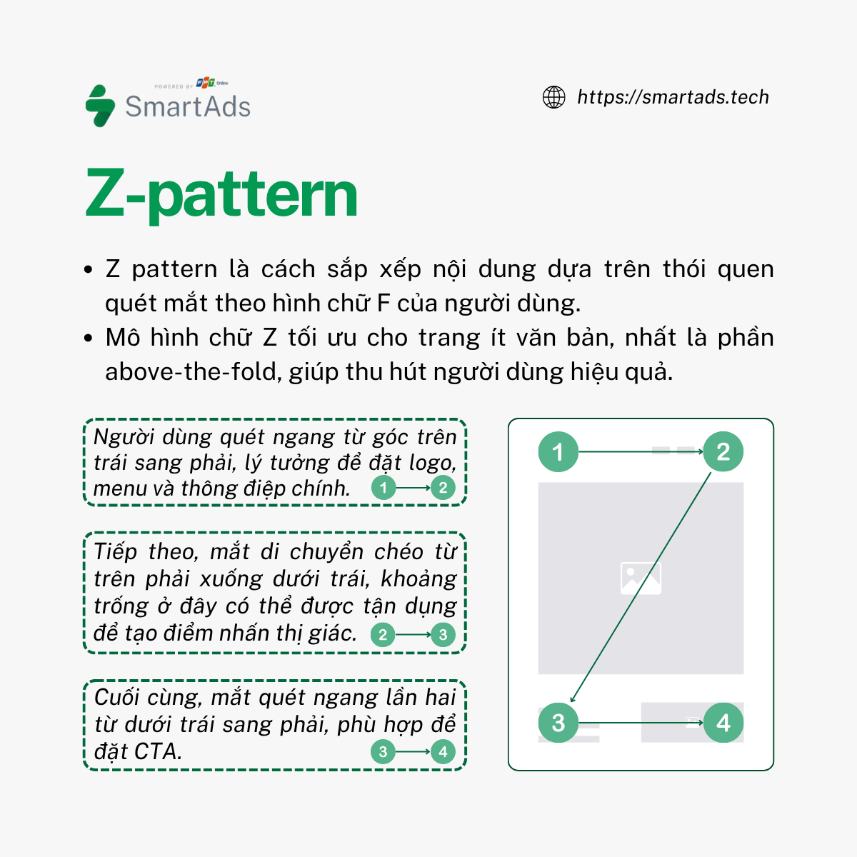
Ba bước này tạo thành mô hình hình dạng chữ Z. Khi áp dụng vào thiết kế trang web đúng cách có thể giúp điều hướng ánh mắt người dùng một cách mượt mà, cải thiện khả năng đọc và thu hút sự chú ý.
2. Khi nào nên sử dụng mô hình chữ Z?
Mô hình chữ Z hiệu quả trên các trang có ít văn bản, như trang chủ và trang đích, giúp thu hút sự chú ý ngay lập tức. Đặc biệt, nó quan trọng trong phần above-the-fold, nơi quyết định liệu người dùng có tiếp tục cuộn xuống hay rời đi. Kết hợp nội dung ngắn gọn, hấp dẫn với bố cục trang web theo mô hình này sẽ giúp tối ưu hóa trải nghiệm và giữ chân khách hàng.
3. Cách tạo mô hình chữ Z hiệu quả trên trang chủ và trang đích
Để áp dụng mô hình chữ Z vào website của bạn nhằm tối ưu hóa trải nghiệm khách hàng, hãy làm theo 3 bước sau:
- Đường ngang trên cùng:
-
Đặt logo ở góc trái để tăng nhận diện thương hiệu.
-
Thêm thanh menu điều hướng chính.
-
Ở góc phải, đặt nút kêu gọi hành động (CTA) với màu sắc nổi bật để thu hút sự chú ý.
-
Hoặc sử dụng tiêu đề lớn, gây ấn tượng ngay từ đầu.
- Đường chéo:
-
Đây là khu vực dẫn dắt người dùng đến CTA.
-
Sử dụng câu ngắn gọn mô tả bạn làm gì, cho ai, và lợi ích ra sao.
- Đường ngang dưới cùng:
-
Đây là điểm nóng cho CTA.
-
Đặt nút CTA ở góc phải để thúc đẩy hành động.
-
Có thể thêm nội dung hỗ trợ, giải thích thêm sau tiêu đề chính.
III. F-pattern, Z-pattern và trạng thái Flow State
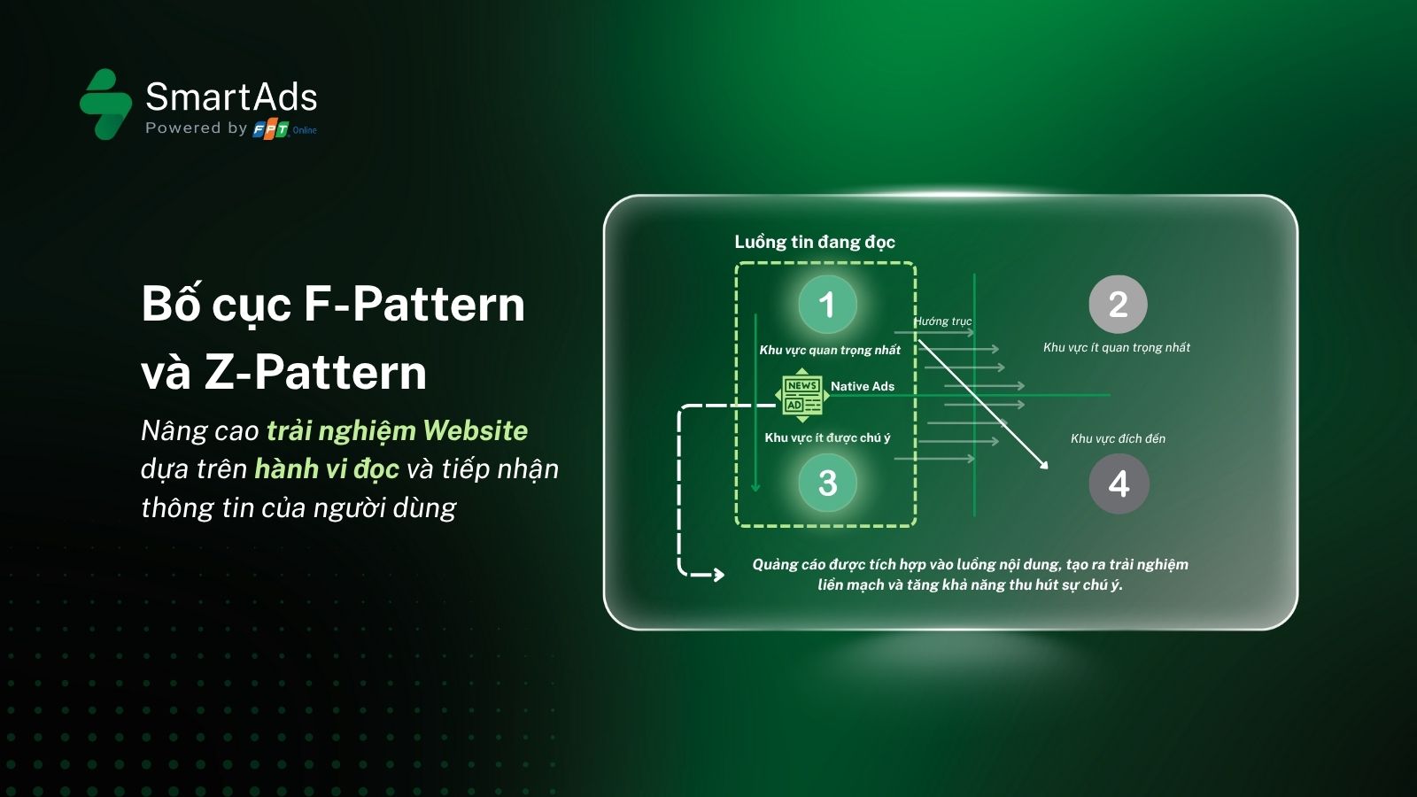
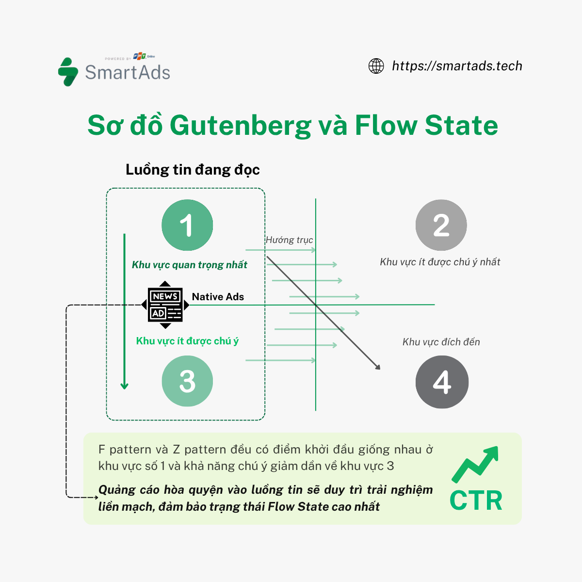
Flow state, hay trạng thái dòng chảy, là trạng thái mà người dùng tập trung cao độ vào một hoạt động, hạn chế sự phân tâm bởi các yếu tố bên ngoài. Trong thiết kế nội dung digital, sơ đồ Gutenberg mô tả cách người dùng quét mắt khi đọc nội dung trên trang web, bắt đầu từ khu vực quan trọng nhất (góc trên bên trái), quét ngang, di chuyển chéo xuống và dừng lại ở khu vực đích đến. Mô hình này là cơ sở chung cho F-Pattern và Z-Pattern, khi sự chú ý nằm ở khu vực số 1 và khu vực số 3, dọc biên bên trái và giảm dần về mức độ phân bố. Sự xuất hiện của Native Ads trong khu vực luồng đọc tin này giúp duy trì trạng thái Flow State khi không gián đoạn trải nghiệm người dùng, từ đó tăng tỷ lệ nhấp chuột (CTR).
Cụ thể, khi người dùng đọc một bài báo về sức khỏe, sự xuất hiện của quảng cáo Native về dược phẩm khéo léo hòa nhập vào nội dung sẽ giúp khách hàng sẽ cảm nhận thông điệp quảng cáo như một phần của bài viết. Điều này không chỉ hạn chế sự bỏ qua quảng cáo mà còn tạo ra trải nghiệm liền mạch và tích cực cho người đọc, duy trì trạng thái Flow state ở mức độ cao nhất.
Hiện tại, SmartAds đang cung cấp giải pháp quảng cáo tự nhiên Native Ads trên các trang báo điện tử. Với việc tận dụng quy luật này để hòa nhập vào trục đọc tự nhiên mà không gây gián đoạn, giảm hiện tượng Ad Blindness, giải pháp của SmartAds giúp thương hiệu tăng khả năng tiếp cận khách hàng tiềm năng và truyền tải thông điệp một cách hiệu quả hơn.