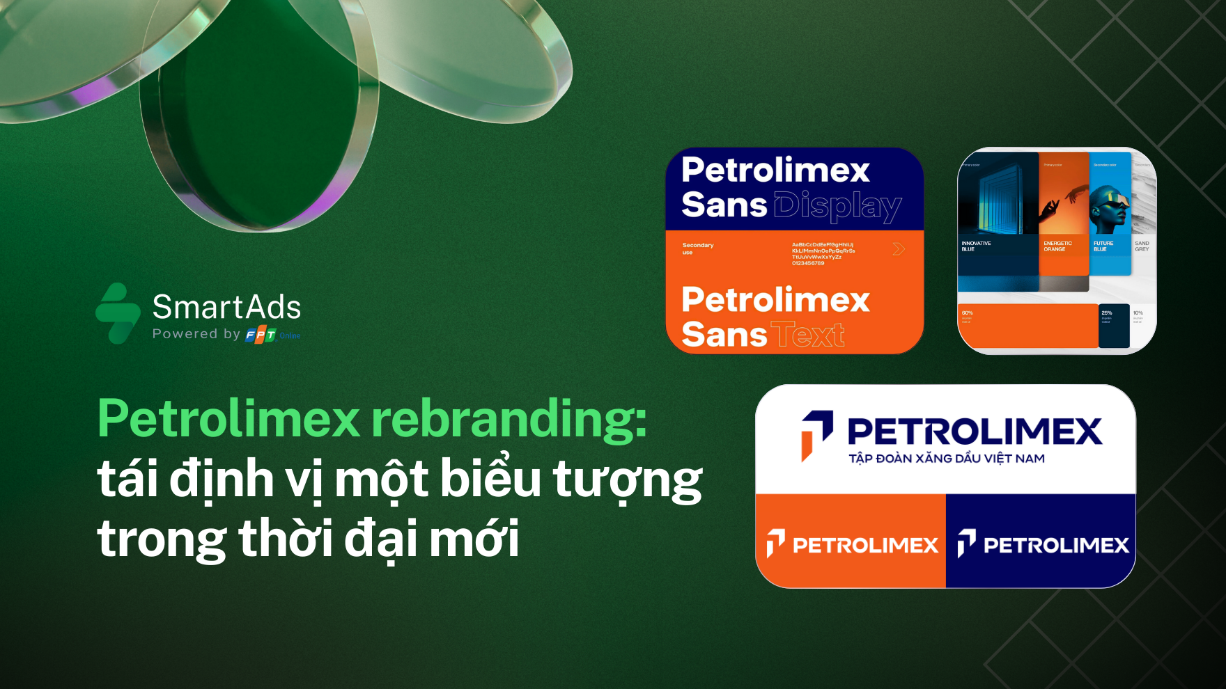
1. The meaning behind the new brand identity design
-
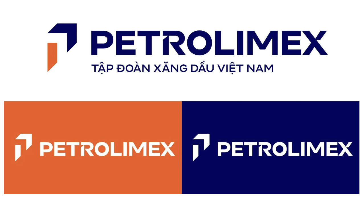
The Forward-Moving “P” Symbol – Preserving Heritage, Connecting the Future
Petrolimex’s new logo retains the iconic “P” — a symbol associated with the brand for decades — but restructures it with stronger, more dynamic lines. At the center sits the number “1,” representing leadership ambition and a long-term development vision in a new era of energy transformation. This refined logo design reinforces brand identity while signaling a bold step forward in Petrolimex’s rebranding journey.
-
Dynamic Color Palette with a Modern Refinement
The two traditional colors — orange and blue — are preserved but optimized for the digital environment. Energy Orange symbolizes vitality and growth momentum, while Innovative Blue conveys a spirit of technology, innovation, and digital transformation.
This combination maintains the brand’s long-standing visual equity embedded in generations of Vietnamese consumers, while delivering a fresher and more adaptable presence across digital platforms — from mobile applications and social media to outdoor signage.
-
Typography and Visual Identity System
Beyond the logo, Petrolimex introduces a custom-designed typeface featuring a distinctive 52-degree cut that enhances brand memorability across all contexts. The extended visual identity system includes flexible graphic patterns, ensuring both consistency and versatility across communication touchpoints.
2. Petrolimex Rebranding: More Than a Visual Refresh
Petrolimex’s rebranding is not merely a visual update but a clear expression of its long-term strategy in the context of profound shifts within the energy sector in Vietnam and globally.
-
Moving Toward a Modern Customer Experience: Petrolimex aims to evolve from a traditional energy brand into a modern, customer-centric organization aligned with rising expectations around service quality and brand experience.
-
Demonstrating a Proactive Innovation Mindset: In a highly competitive and rapidly evolving energy market, a technology-inspired brand identity helps Petrolimex appear more dynamic and relevant to both existing customers and younger consumer generations.
-
Reinforcing Its Role as a National Brand: With more than 70 years of presence in Vietnam, Petrolimex represents not only an energy provider but also a symbol accompanying the country’s socio-economic development. Rebranding offers an opportunity to retell this legacy with greater clarity and strategic depth.
3. Rebranding Lessons for Vietnamese Enterprises
From the Petrolimex rebranding case, other businesses in Vietnam can draw several strategic insights:
-
Rebranding must align with a clear strategy: Updating brand identity should not be merely a cosmetic change but must connect with long-term direction, operational restructuring, or management innovation.
-
Preserve heritage while adapting to the present: Traditional brand values are valuable assets, yet they need refinement to stay relevant—especially in today’s digital-first environment.
-
A logo must tell the brand story: An effective symbol is not only visually appealing but also communicates vision, core values, and future direction.
-
Rebranding must integrate brand identity, communication, and conversion strategy: Updating logos, colors, or visual systems is insufficient without a synchronized communication plan to explain the rationale, reposition the brand in customers’ minds, and build internal alignment. Businesses should deploy multi-channel campaigns—from PR and digital marketing to social media and all online and offline touchpoints—to ensure the brand story is delivered consistently and with depth.
Conclusion
Petrolimex’s brand identity transformation marks a strategic milestone, not only refreshing a long-standing image but reaffirming its commitment to becoming a more confident, modern, and future-ready energy brand in Vietnam.
Ultimately, rebranding is not simply about “looking different,” but about answering three fundamental questions: Who are we as a brand? Where are we now? And where are we heading? For Petrolimex, the new brand identity serves as a declaration of long-term vision—preserving core values while confidently entering a new era of energy and digital transformation.
About SmartAds, formerly known as eClick, developed by FPT Online—one of Vietnam’s pioneers in digital technology and media. Through continuous innovation and strategic partnerships with leading premium publishers, SmartAds has positioned itself at the forefront of elevating advertising standards in Vietnam. The platform aspires to become a trusted partner for brands seeking sustainable growth and effective customer engagement. If you are looking for an advertising solution that optimizes both brand visibility and performance, feel free to create an account and experience campaign setup on SmartAds here.