Sacombank changes its logo: a strategic move in the brand repositioning journey
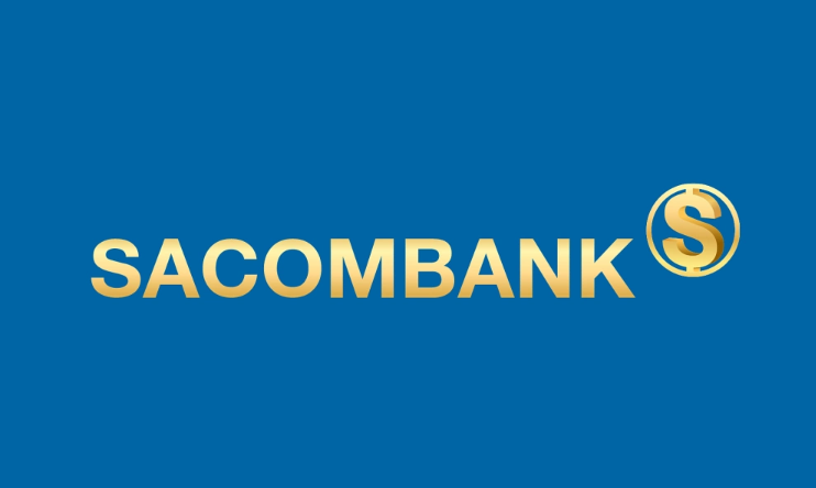
Sacombank’s new logo features a deep blue background combined with metallic gold typography, highlighted by a stylized “S” symbol enclosed within a closed circle. This marks the sixth time the bank has changed its logo since its establishment, demonstrating that rebranding has consistently accompanied each strategic development phase.
According to Sacombank, this brand identity refresh is not merely cosmetic, but a strategic move that reflects a new operational direction—focusing on strengthening internal capabilities, elevating governance standards, and pursuing sustainable growth.
The meaning of Sacombank’s new logo from a branding perspective
The “S” symbol: the core of brand identity
At the heart of the logo is a stylized “S”, which not only represents the first letter of Sacombank but also serves as a consistent brand identifier throughout the system.
On a symbolic level, the “S” embodies three core values:
-
Stability: a solid financial foundation and rigorous governance
-
Sustainability: long-term development that balances the interests of the bank, customers, and society
-
Success: creating added value for shareholders and the broader economy
The soft yet decisive curves of the “S” evoke the idea of a continuous financial flow, symbolizing connectivity and the circulation of value within a modern financial ecosystem. At the same time, the “S” shape subtly references Vietnam’s S-shaped geography, serving as a statement of identity: Sacombank is a Vietnamese bank, developed in Vietnam, and committed to accompanying the country’s economic growth. Surrounding the “S” is a seamless circular form, symbolizing security and protection—core principles in the banking and finance industry.
This is a familiar visual choice in global financial branding, yet Sacombank has refined it to align with its positioning of being “solid – standardized – long-term.”
Brand colors: blue, gold, and the language of trust
Rather than pursuing a loud or disruptive image, Sacombank’s new logo conveys maturity and composure. In this Sacombank rebranding, the color palette is retained but refined to appear more sophisticated and contemporary.
-
Blue represents trust, transparency, and governance standards. It is a dominant color in the finance and banking sector due to its ability to convey security and psychological stability.
-
Metallic gold symbolizes value, achievement, and prosperity, while also reflecting aspirations for sustainable long-term growth.
This combination creates a balanced visual identity: formal enough to reinforce trust, yet modern enough to adapt to the digital era.
Rebranding lessons for businesses from the Sacombank case
From this case study, businesses can draw several key lessons when undertaking a rebranding strategy:
-
1. Rebranding must be tied to strategy, not just design: A logo change only has meaning when it goes hand in hand with restructuring, shifts in management mindset, or a clearly defined growth direction.
-
2. Brand identity should reflect organizational maturity: Companies in a mature stage should prioritize stability, standardization, and sustainability rather than chasing short-term visual trends.
-
3. Symbols must carry depth and meaning: An effective logo is not only visually appealing but must also “tell a story” about vision, core values, and brand identity.
-
4. Consistency across all touchpoints is critical: Rebranding only delivers results when implemented cohesively across online and offline channels, communications, services, and customer experience.
Conclusion
The Sacombank brand identity transformation is not merely a communication event, but a milestone in its strategic repositioning for a new growth phase. The new logo, updated color system, and reaffirmed values signal a clear focus on quality, governance standards, and sustainable growth.
From a branding perspective, this is a compelling example that shows: successful rebranding is not about “looking different,” but about clearly defining who you are, where you stand, and where you aim to go.